Climate Change Indicators: High and Low Temperatures
This indicator describes trends in unusually hot and cold temperatures across the United States.
Figure 1. Area of the Contiguous 48 States with Unusually Hot Summer Temperatures, 1910–2023
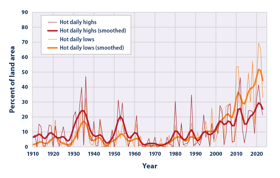
This graph shows the percentage of the land area of the contiguous 48 states with unusually hot daily high and low temperatures during the months of June, July, and August. The thin lines represent individual years, while the thick lines show a nine-year weighted average. Red lines represent daily highs, while orange lines represent daily lows. The term “unusual” in this case is based on the long-term average conditions at each location.
Data source: NOAA, 20244
Web update: June 2024
Figure 2. Area of the Contiguous 48 States with Unusually Cold Winter Temperatures, 1911–2024
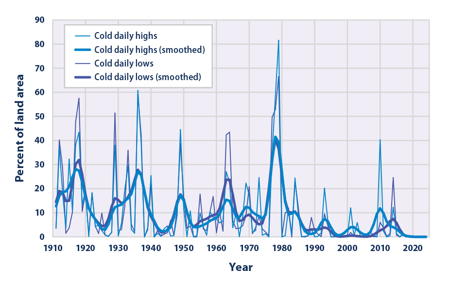
This graph shows the percentage of the land area of the contiguous 48 states with unusually cold daily high and low temperatures during the months of December, January, and February. The thin lines represent individual years, while the thick lines show a nine-year weighted average. Blue lines represent daily highs, while purple lines represent daily lows. The term “unusual” in this case is based on the long-term average conditions at each location.
Data source: NOAA, 20244
Web update: June 2024
Figure 3. Change in Unusually Hot Temperatures in the Contiguous 48 States, 1948–2023
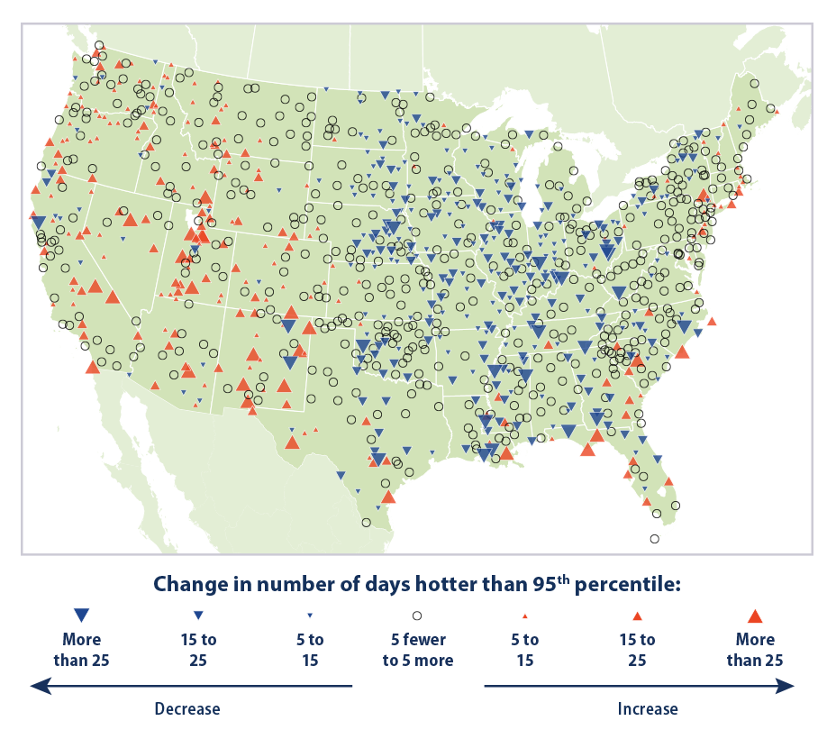
This map shows trends in unusually hot temperatures at individual weather stations that have operated consistently since 1948. In this case, the term “unusually hot” refers to a daily maximum temperature that is hotter than the 95th percentile temperature during the 1948–2023 period. Thus, the maximum temperature on a particular day at a particular station would be considered “unusually hot” if it falls within the warmest 5 percent of measurements at that station during the 1948–2023 period. The map shows changes in the total number of days per year that were hotter than the 95th percentile. Red upward-pointing symbols show where these unusually hot days are becoming more common. Blue downward-pointing symbols show where unusually hot days are becoming less common.
Data source: NOAA, 20245
Web update: June 2024
Figure 4. Change in Unusually Cold Temperatures in the Contiguous 48 States, 1948–2023
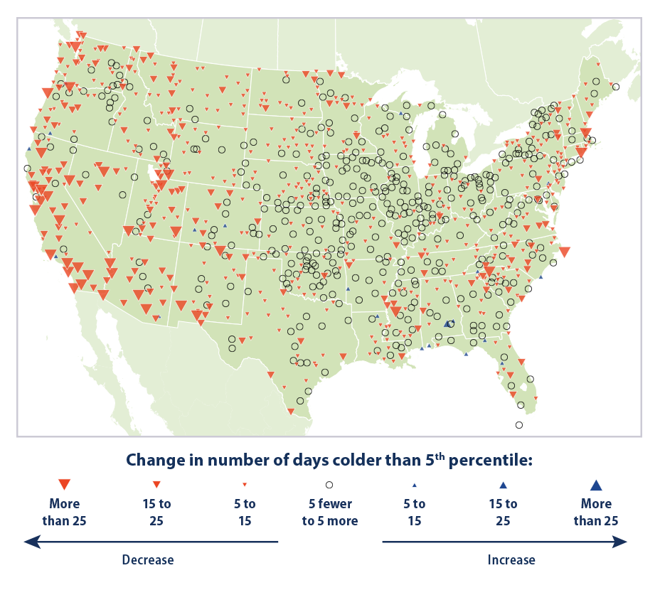
This map shows trends in unusually cold temperatures at individual weather stations that have operated consistently since 1948. In this case, the term “unusually cold” refers to a daily minimum temperature that is colder than the 5th percentile temperature during the 1948–2023 period. Thus, the minimum temperature on a particular day at a particular station would be considered “unusually cold” if it falls within the coldest 5 percent of measurements at that station during the 1948–2023 period. The map shows changes in the total number of days per year that were colder than the 5th percentile. Blue upward-pointing symbols show where these unusually cold days are becoming more common. Red downward-pointing symbols show where unusually cold days are becoming less common.
Data source: NOAA, 20245
Web update: June 2024
Figure 5. Record Daily High and Low Temperatures in the Contiguous 48 States, 1950–2009 
This figure shows the percentage of daily temperature records set at weather stations across the contiguous 48 states by decade. Record highs (red) are compared with record lows (blue).
Data source: Meehl et al., 20096
Web update: April 2021
Key Points
- Nationwide, unusually hot summer days (highs) have become more common over the last few decades (see Figure 1). The occurrence of unusually hot summer nights (lows) has increased at an even faster rate. This trend indicates less “cooling off” at night.
- The 20th century had many winters with widespread patterns of unusually low temperatures, including a particularly large spike in the late 1970s (see Figure 2). Since the 1980s, though, unusually cold winter temperatures have become less common—particularly very cold nights (lows).
- The two maps show where changes in the number of days with unusually hot (above the 95th percentile) and cold (below the 5th percentile) days have occurred since 1948. Based on this way of looking at hot days, unusually high temperatures have increased in the western United States and in several areas along the Gulf and Atlantic coasts but decreased in much of the middle of the country (see Figure 3). The number of unusually cold days has generally decreased throughout the country, particularly in the western United States (see Figure 4).
- If the climate were completely stable, one might expect to see highs and lows each accounting for about 50 percent of the records set. Since the 1970s, however, record-setting daily high temperatures have become more common than record lows across the United States (see Figure 5). The decade from 2000 to 2009 had twice as many record highs as record lows.
Background
Unusually hot or cold temperatures can result in prolonged extreme weather events like summer heat waves (see the Heat Waves indicator) or winter cold spells. Heat waves can lead to illness and death, particularly among older adults, the very young, and other vulnerable populations (see the Heat-Related Deaths and Heat-Related Illnesses indicators).1 People can also die from exposure to extreme cold (hypothermia) (see the Cold-Related Deaths indicator). In addition, prolonged exposure to excessive heat and cold can damage crops and injure or kill livestock. Extreme heat can lead to power outages as heavy demands for air conditioning strain the power grid, while extremely cold weather increases the need for heating fuel.
Record-setting daily temperatures, heat waves, and cold spells are a natural part of day-to-day variation in weather. As the Earth’s climate warms overall, however, temperatures that are unusually hot for a given location are expected to increase.2 Higher values of the heat index (which combines temperature and humidity to describe perceived temperature) are expected to increase discomfort and aggravate health issues. Conversely, cold spells are expected to decrease. In most locations, scientists expect the number of warm days and warm nights to increase.3 This change will provide less opportunity to cool off and recover from daytime heat.
About the Indicator
This indicator examines trends in unusual temperatures from several perspectives:
- Unusually hot summer temperatures and cold winter temperatures nationwide (Figures 1 and 2).
- The change in the number of days with unusually hot and cold temperatures at individual weather stations (Figures 3 and 4).
- Changes in record high and low temperatures (Figure 5).
The data come from thousands of weather stations across the United States. National patterns can be determined by dividing the country into a grid and examining the data for one station in each cell of the grid. This method ensures that the results are not biased toward regions that happen to have many stations close together.
Figures 1 and 2 show trends in the percentage of the country’s area experiencing unusually hot temperatures in the summer and unusually cold temperatures in the winter. These graphs are based on daily maximum temperatures, which usually occur during the day, and daily minimum temperatures, which usually occur at night. At each station, the recorded highs and lows are compared with the full set of historical records. After averaging over a particular month or season of interest, the coldest 10 percent of years are considered “unusually cold” and the warmest 10 percent are “unusually hot.” For example, if last year’s summer highs were the 10th warmest on record for a particular location with more than 100 years of data, that year’s summer highs would be considered unusually warm. Data are available from 1910 to 2023 for summer (June through August) and from 1911 to 2024 for winter (December of the previous year through February).
Figures 3 and 4 show how trends in unusually hot and cold daily temperatures throughout the year vary by location. These maps cover about 1,050 weather stations that have operated since 1948. Figure 3 was created by reviewing all daily maximum temperatures from 1948 to 2023 and identifying the 95th percentile temperature (a temperature that one would only expect to exceed in five days out of every 100) at each station. Next, for each year, the total number of days with maximum temperatures higher than the 95th percentile (that is, unusually hot days) was determined. The map shows how the total number of unusually hot days per year at each station has changed over time. Figure 4 is similar except that it looks at unusually cold days, based on the 5th percentile of daily minimum temperatures and reviews daily minimum winter temperatures from 1911 to 2023.
Many people are familiar with record daily high and low temperatures, which are frequently mentioned in weather reports. Figure 5 depicts trends in these records by comparing the number of record-setting highs with the number of record-setting lows by decade. These data come from a set of weather stations that have collected data consistently since 1950.
About the Data
Indicator Notes
Temperature data are less certain for the early part of the 20th century because fewer stations were operating at that time. In addition, measuring devices and methods have changed over time, and some stations have moved. The data have been adjusted to the extent possible to account for some of these influences and biases, however, and these uncertainties are not sufficient to change the fundamental trends shown in the figures.
Data Sources
The data for this indicator are based on measurements from weather stations managed by the National Oceanic and Atmospheric Administration. Figures 1 and 2 come from the U.S. Climate Extremes Index, which is based on a smaller group of long-term weather stations that are tracked by the National Centers for Environmental Information and referred to as the U.S. Historical Climatology Network. Figures 3 and 4 use data from a somewhat larger set of stations tracked by the National Centers for Environmental Information, known as the Global Historical Climatology Network. Figure 5 uses National Weather Service data processed by Meehl et al. (2009).6 All of these weather station records are available online at: www.ncdc.noaa.gov, and information about the Climate Extremes Index can be found at: www.ncdc.noaa.gov/extremes/cei.
Technical Documentation
References
1 Hayden, M. H., Schramm, P. J., Beard, C. B., Bell, J. E., Bernstein, A. S., Bieniek-Tobasco, A., Cooley, N., Diuk-Wasser, M., Dorsey, M. K., Ebi, K., Ernst, K. C., Gorris, M. E., Howe, P. D., Khan, A. S., Lefthand-Begay, C., Maldonado, J., Saha, S., Shafiei, F., Vaidyanathan, A., & Wilhelmi, O. V. (2023). Chapter 15: Human health. In A. R. Crimmins, C. W. Avery, D. R. Easterling, K. E. Kunkel, B. C. Stewart, & T. K. Maycock (Eds.), Fifth National Climate Assessment. U.S. Global Change Research Program. https://doi.org/10.7930/NCA5.2023.CH15
2 Marvel, K., Su, W., Delgado, R., Aarons, S., Chatterjee, A., Garcia, M. E., Hausfather, Z., Hayhoe, K., Hence, D. A., Jewett, E. B., Robel, A., Singh, D., Tripati, A., & Vose, R. S. (2023). Chapter 2: Climate trends. In USGCRP (U.S. Global Change Research Program), Fifth National Climate Assessment. https://doi.org/10.7930/NCA5.2023.CH2
3 IPCC (Intergovernmental Panel on Climate Change). (2021). Climate change 2021—The physical science basis: Working Group I contribution to the Sixth Assessment Report of the Intergovernmental Panel on Climate Change (V. Masson-Delmotte, P. Zhai, A. Pirani, S. L. Connors, C. Péan, S. Berger, N. Caud, Y. Chen, L. Goldfarb, M. I. Gomis, M. Huang, K. Leitzell, E. Lonnoy, J. B. R. Matthews, T. K. Maycock, T. Waterfield, O. Yelekçi, R. Yu, & B. Zhou, Eds.). Cambridge University Press. https://doi.org/10.1017/9781009157896
4 NOAA (National Oceanic and Atmospheric Administration). (2024). U.S. Climate Extremes Index. Retrieved April 18, 2024, from www.ncei.noaa.gov/access/monitoring/cei
5 NOAA (National Oceanic and Atmospheric Administration). (2024). National Centers for Environmental Information. Retrieved April 1, 2024, from www.ncei.noaa.gov
6 Meehl, G. A., Tebaldi, C., Walton, G., Easterling, D., & McDaniel, L. (2009). Relative increase of record high maximum temperatures compared to record low minimum temperatures in the U.S. Geophysical Research Letters, 36(23), L23701. https://doi.org/10.1029/2009GL040736
Learn about other indicators in this section